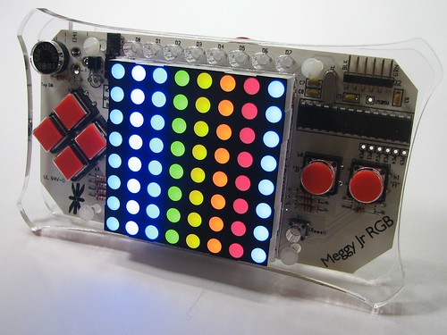
A while ago, I ordered a Meggy Jr RGB. It’s a kit you can put together to build a programmable handheld game device:

I’m building it tonight at Willoughby and Baltic, the hackerspace I’m a member of.
Once I get the hardware built, I’ll need to program a game for it. It’s basically what you see in the picture: an 8×8 RGB LED display, a d-pad, two other buttons, a tiny buzzer for a speaker, and a 1×8 array of single color status LEDs (for score, or number of lives, or whatever else).
{ 10 comments }
I’ll also add that I am considering making a blippy rhythm game, along the lines of the Bit Generations series.
Neat design challenge… essentially, make a game that runs at 8×8 pixel resolution.
Rhythm game is one possibility.
My first thought was to make a parody of some other video game, reduced to insanely low resolution. Like, re-imagine what GTA would be like if you couldn’t actually see anything :)
Chess would actually be interesting if you knew where the pieces were but not WHAT they were… sort of a fog-of-war (especially if the pieces in the back row were randomly positioned at game start). The programming on that would probably keep you busy for awhile.
A scrolling maze/chase game would also work. Use solid lights for walls, blinking lights for the avatar and enemies.
You could also remake Passage =)
Today’s captcha is ‘scrabili’, so I think it’s trying to say you should make a Scrabble variant, but I’m unconvinced.
I’m voting for a Roguelike game. If you are at all familiar with Rogue/Moria/Nethack you know that they used a CURSES-like library and letters for monsters/walls/you/stuff/etc.
You can use colors for a couple monsters of varying strength, the bar at the top for HP, one color for you, one for the walls, and have the maze scroll around.
Oh wow, a Roguelike! My favorite suggestion so far. Although I’d have to strip down the implementation — Roguelikes depend on lo-fi output but also hi-fi input (they basically use the entire keyboard).
Take a look at some of the roguelikes on console if you’re interested in going that path. It can be done quite well with a d-pad and a couple of buttons. Think of it this way — the PC roguelikes don’t have complicated controls because they NEED to (seriously, how many controls could be collapsed into a single context-sensitive “Use” command?), but rather because it’s easier to program different commands for everything :)
The biggest challenge here, I think, would be that most roguelikes actually have a fair amount of text in them. Even if the graphics are lo-fi, you can still tell a potion from a scroll or a wand, and you can still select a spell from a large text menu. You don’t have that here, so you’ll have to find another way.
I suppose when you either find an item or go to an item-use menu you could draw an 8×8 picture of the item (and make a decent scroll or potion that way). Another option is to abolish the concepts of items and inventory altogether, and see if it’s possible to design a roguelike without them.
I was precisely thinking along the lines of streamlining the Roguelike itself. The lack of text is definitely an issue. I do like the idea of showing a picture of the item you pick up, but the problem is, how do you remember which items you have? Maybe I’ll only make one or two items, perhaps a health potion and a key? But then, I could just use unique colors for those. Stylistically it would still be nice to have a picture appear on pickup, though.
My roguelike Gruesome could maybe be ported to this with a few tweaks. Explore dungeons, avoid light, eat adventurers, with maybe some score system to replace game progression. The grue would be a dark spot (always centred I guess), with walls blue, floor dim blue, enemies yellow, and light white. D-pad for movement and the two buttons for the grue’s two abilities (ShadowWalk and Darkness spell, though they maybe need not be kept in). Various tweaks would need to be made, in particular removing diagonal movement, but it could still function very well. Gameplay is perfect for this sort of thing – short, puzzle-esque, simplistic and difficult.
Check it out here and let me know if you’re interested:
http://gruesomegames.com/
And best of luck with your game – seems to be coming along very nicely.
You could manage an inventory with up to seven slots, plus a pick-up slot. Dedicate a button to access the inventory, scroll with left and right, push the other button to select the current item for swapping with the pick-up slot. The status light blinks the slot being swapped. During the game, the status light shows which slot is the active item: sword, wand, boots of jumping..
Heck, you could that with one line of the color display, let the player remember the active item, and save the status lights for something else.
Dude, you’ve taken over my class’ design challenge today! You’ve also taken over my wallet and made me desire such a peculiar device.
Arduino looks pretty nice for such a small device too.
Rob Beschizza’s gone ahead and written a roguelike in 8 pixels… http://www.boingboing.net/2011/06/20/tinyhack-minimalist-1.html
Comments on this entry are closed.