I got some great comments on my last post about business cards, and I’m going to highlight them here in case you missed them. But first I’m going to subject you to a little rant that I’ve given at conferences.
Corporate vs. Personal Cards
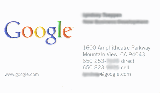
There are two kinds of business cards. There’s the card that represents you as the employee of a company, and there’s the card that represents you as a person. The key difference is that the company card puts the identity of the company over your own identity. Here’s an example of a corporate business card:
The logo and the address of the company take up most of the non-white space on the card.
Now don’t get me wrong: this is a fine corporate business card. It does exactly what it’s supposed to do. But it sets a bad example for personal business cards. I often see students (and even professionals!) emulate the design of corporate cards on their personal cards, sometimes going so far as to design a logo and make that the biggest thing on their card.
Your personal card should reflect who you are. I don’t mean that in the warm and fuzzy sense: it literally needs to tell me who you are so I can remember you. This means your name should be the biggest thing on the card by far.
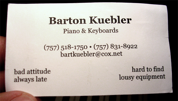
Here’s an example of a great personal business card.
The card above is from an excellent article about business cards for musicians (although the advice applies to anyone). There’s nothing fancy about it in terms of card stock or font or color. It’s completely unremarkable except that it’s well-designed and memorable. The guy’s name is the biggest single information band on the card, and right under that it tells me what he does. There’s contact information below, and then in the corners there are some tongue-in-cheek descriptors of the guy’s services. (This is a great technique for someone to use — provided you remember that this card has a context. Specifically this is a card that will be given to other musicians. “Bad attitude” and “always late” are things that will make a fellow musician laugh. If this same musician were trying to get booked to play weddings, the joke would completely backfire.)
Anyway, remember: you are not an anonymous drone. Your business card needs to reflect that.
Comment Roundup
I got some great comments on my business card post.
While I recommended Scribus for those designing their own business cards, Noah Kantrowitz pointed out Businesscardland, a website where you can design a card from templates for free. It’ll even render a PDF that you can take to a print shop.
Jeromie Walters asked whether he should put a head shot of himself on his card. Brenda Brathwaite once told me that she tried putting her head shot on her card, and the only thing it did was make her feel like a real estate agent! Bottom line: don’t put a photo of yourself on your card. Consider a cartoon or an abstraction of your face. It’s what I do.
Ian Schreiber talked about the backpack he always brings to GDC.
As for running out during the day, personally I always carry my backpack with me. In it I have:
* All of my cards, so I can “restock” in a few seconds rather than having to head back to the hotel;
* Notebooks and pens, both to take notes myself and to offer to the people sitting next to me if they need it;
* Laptop computer and power cord, also for taking notes and in case anyone needs one to show a software demo or something;
* Emergency snacks and drinks, so that I’m never in a session where I’m distracted from a brilliant speaker by something mundane like bodily hunger signals (and likewise, headache medicine in case my skull picks a bad time to vasodilate);
* Board games, because I want people to think of me when they’re trying to find the fun
* Any swag or random stuff I pick up along the way.My shoulders are usually sore by the end of the week from walking around like a pack mule, but the convenience of having everything I need in reach at a moment’s notice is too great to give up.
Alex Forsythe asked how a student should communicate their area of expertise on their business card, since a student can’t really claim to be a level designer if they haven’t really designed many levels. I responded that “Aspring Level Designer” or “Student of Level Design” would be fine. Ian Schreiber gave the following response:
I’ve seen some pretty clever student business cards. Darius wrote his tagline “a generally useful guy to know” which, aside from being accurate, was more memorable than “aspiring game programmer/designer” or whatever.
I saw one student card, I still have it somewhere, that introduced the person as “the mythical female programmer”… again, more memorable than “aspiring.”
I suppose you need to be careful with this, though. It’s easy to cross the line from “memorable” to “cliche” or “cheesy”. So maybe that kind of thing is best for your second year at GDC, after you’ve already seen what other cards are out there.
As always, thanks to everyone who commented for their good questions and helpful answers.
Update, June 2010: Erin Hoffman has additional advice:
Ian’s point is a great one. It’s the one thing I would add to Darius’s advice… I suspect for first-timers the words on the card are actually more important than the card’s visual design, though it’s certainly possible to excessively advertise non-pro status by having a business card that looks out-of-date, is too busy, or has poorly printed graphics. The worst one I saw from a student was glossy and black with a grainy graphic of something on it — I’m not even sure what. A classy but plain non-glossy white card with Times New Roman on it is much safer.
When I was a student I had “Creativity for Hire” on my card, which got comments from most of the people I handed it to. I didn’t really even expect that reaction — I just had an assortment of things I wanted to do and needed a broad phrase that would capture them. And I didn’t have that card very long. :) If I had to do it over again I would stick to the same — keep it simple, put your web address on the card, and aim your thought energy at a memorable (unique) phrase that encapsulates what you have to offer


{ 8 comments }
Great insight!
I’ve had some luck with an old photograph of myself at age 4 playing on the Apple IIe, which is especially relevant because I design children’s games. It’s a real conversation starter, and though I cringe slightly that the picture is dark and a little out of focus, I think it’s worth the expense of a double-sided card. I print ‘em at moo.com. Full size business, not mini.
Okay, fiiiine, I finally re-designed and ordered my cards. Geez.
I felt pressured after all of your good advice and such. ;)
(Thanks, btw.)
I created a simple, text-only card and placed an order through Staples. We’ll see how it turns out and/or goes over at GDC. I have to say, it was fun indulging in a little quirkiness – I didn’t have much of a chance to go the playful personal-branding route back when I worked in other industries.
Does anyone have an opinion on putting short, important descriptors of one’s talents on his/her card?
For example, “Scrummaster Experience” for a producer, or “x published titles” for..well anyone?
It is a very good idea.
(Sorry but that’s pretty much all I have to say on that!)
Glad to help, Darius! Enjoying your posts. I need to remember to stop by more often…
This doesn’t really convey professionalism, but it helps people to remember you when you write to them after the conference. You can say, “I don’t expect you to remember me, but I was the man/woman who….”:
Cultivate a distinctive look that suits you. Not a squirrel costume, just something memorable. Corvus Elrod’s mustache. Darius Kazemi’s bright orange shirts. Chris Crawford’s tunicles. My top hat.
This may be more difficult for women, as they get big points off from other women for sartorial weirdness. But do it anyway. Purple hair. Trench coat. Vampire fangs.
I would like to add to what Tracy Lawson said. Is it okay to include a picture if it is silly or remarkable in some way? I have this great picture of my 5 year old self, splashing in puddle with nothing but rain boots on. It was shot while I faced away from the camera and at angle, so no private parts are visible. I was condsidering sticking it somewhere in the corner of my card. Is something like this too much?
I think that’s fine. What you want to avoid is a head shot of yourself — it makes you look like a real estate agent.
Comments on this entry are closed.
{ 3 trackbacks }